Become a Member

Join PSC
Fill 1
PSC Rally across the Brooklyn Bridge

Home » Clarion » 2011 » December 2011 » Wealth, Wages and Inequality– In Pictures

Wealth, Wages and Inequality– In Pictures

By

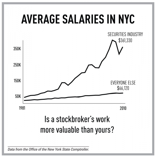
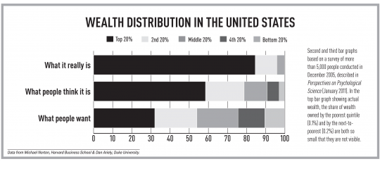
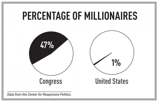
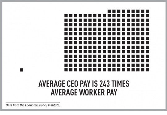
The Occupy movement has shifted the national conversation about income inequality in recent months. However, signs of the enormous gap between the very wealthy and everyone else are everywhere.
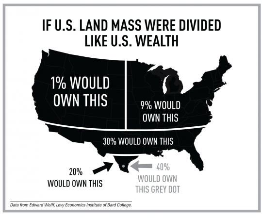
11-LandMass.jpg

11-AveCEOPay.jpg

11-AveSalaries.jpg

Second and third bar graphs based on a survey of more than 5,000 people conducted in December 2005, described in Perspectives on Psychological Science (January 2011). In the top bar graph showing actual wealth, the share of wealth owned by the poorest quintile (0.1%) and by the next-to-poorest (0.2%) are both so small that they are not visible.
11-WealthDistribution_0.jpg

11-PercentMillionaires.jpg

______________________________

Images or design concepts thanks to occupydesign.org, except for Millionaires in Congress chart (chrispiascik.com) and wealth distribution bar graphs (Norton and Ariely in Perspectives on Psychological Science, January 2011).

Jump to Content